Case study | Product Design · Branding · Accessibility
Turning the digital education gap into a product problem
Educational platform for post-COVID blended learning built from 245 surveys in real classrooms, a pivotal mobile-first decision, and a design system validated for three types of color blindness.
Role
Product Designer
UX research, architecture, UI, branding and accessibility
Team
Solo project
End-to-end design
Duration
9 months
September 2020 — June 2021
Tools
Adobe XD
Miro · Adobe Creative Suite
TL;DR
Understand the project in 3 key points
01
CONTEXTMaster's thesis during the pandemic — no briefing, no team and a global education crisis impacting students and teachers as the client. UNICEF summarized it: "there was no emergency plan in education".
02
KEY DECISIONResearch demolished my initial hypothesis. Only 30% of students had their own device in class, but nearly all had access to a smartphone at home. I pivoted the project from a desktop application to a mobile-first platform designed for mid-range devices and low data consumption.
03
RESULTFunctional prototype for mobile and desktop based on 245 surveys in 7 schools, 5 semi-structured interviews and a benchmark of 8 platforms. Visual identity and design system of 80+ components validated for tritanopia, protanopia and deuteranopia.
Context
When the digital gap becomes educational exclusion
The pandemic transformed classrooms and exposed a critical reality. At the peak of lockdown, school closures affected more than one billion students worldwide (UNESCO, 2020). In Spain, the COTEC Foundation identified three key fractures: the access gap (devices), the usage gap (digital competency) and the school gap (home resources).
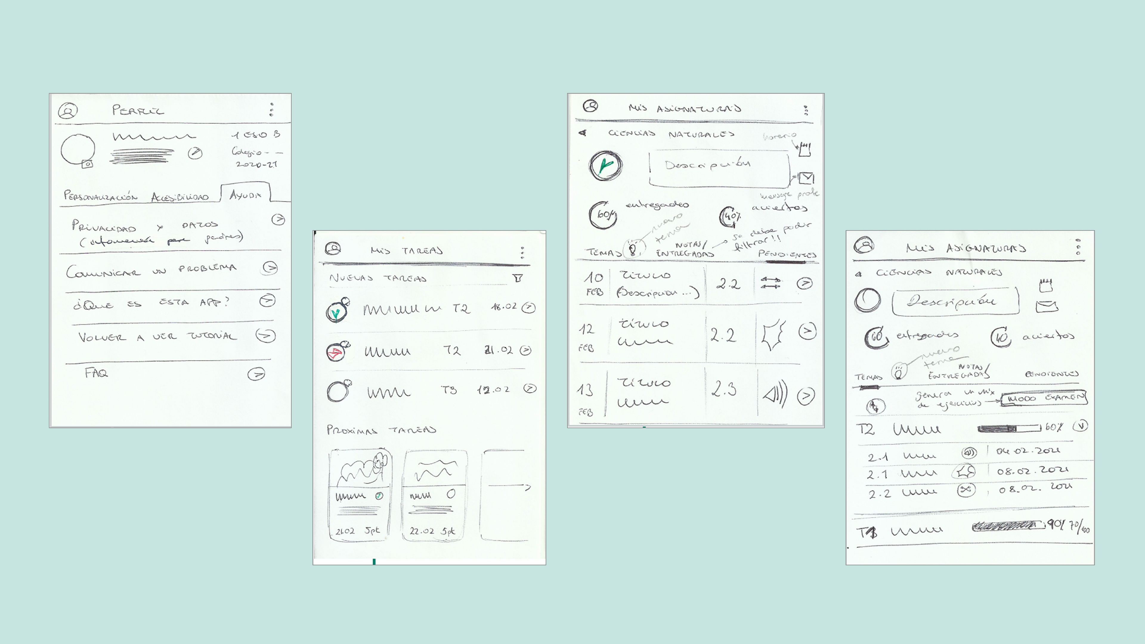
First sketches (wireframes) of Hipatia, a mobile-first app for blended education.
The challenge
Designing a platform that was not another file repository, but an inclusive ecosystem.
The goal
Mitigating these gaps through a user experience that guaranteed continuity of learning for students aged 12 to 14, regardless of their socioeconomic context.
Scope
Starting point and real constraints
- A personal challengeIndividual thesis where I took on the roles of UX Researcher, Designer and Brand designer.
- Minor usersUnder-age users, which meant managing legal permissions with the regional Education Department.
- An exceptional situationActive pandemic: interviews and research had to be conducted remotely.
- SAM modelI adopted the SAM (Successive Approximation Model) for allowing rapid iterations within a tight schedule.
- Scope definitionI scoped the design to the first year of secondary school (ages 12–14) to work with a specific curriculum.
- Mobile-first strategyI pivoted to a mobile-first strategy after discovering the lack of computers in students' homes.
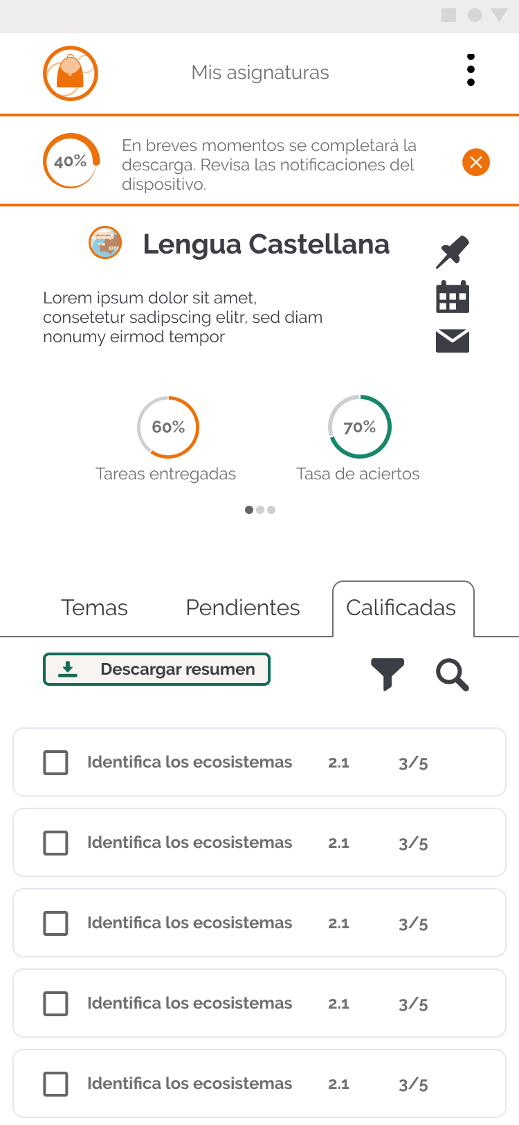
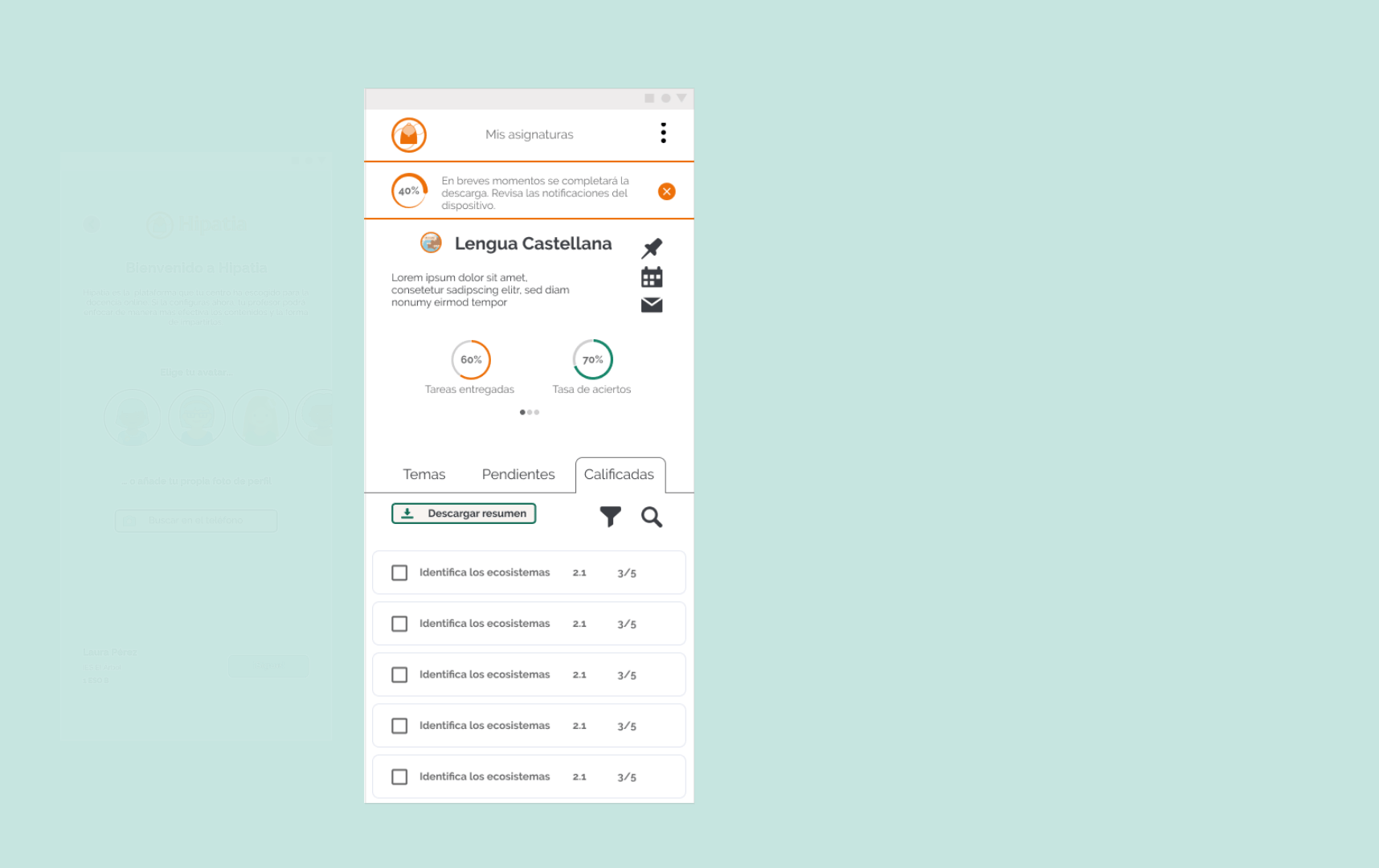
- Formative, not summative assessmentHipatia measures through continuous feedback and activities that monitor the student's progress in real time. The formative model defines the entire architecture: the progress dashboard, teacher alerts and the automatic feedback loop.
- UDL Guidelines (Universal Design for Learning, CAST)Multiple response formats and ways of releasing content toward the same objective. Inclusion was a design condition from the very first idea, justifying product decisions, features, alternative activities and color blindness validation.
- Blended learning with group rotationThe model applied in the visited schools combined some students in class and some at home, rotating. The platform had to work seamlessly in both contexts without the student losing track between sessions. A unified in-person/digital timeline was therefore a priority.
- Digital curriculum: replacing the activity bookHipatia doesn't replace video calls or textbooks, but the exercise book. This scope defines the app's focus on tasks, feedback, progress and resources, while leaving out streaming, attendance management and theoretical content.
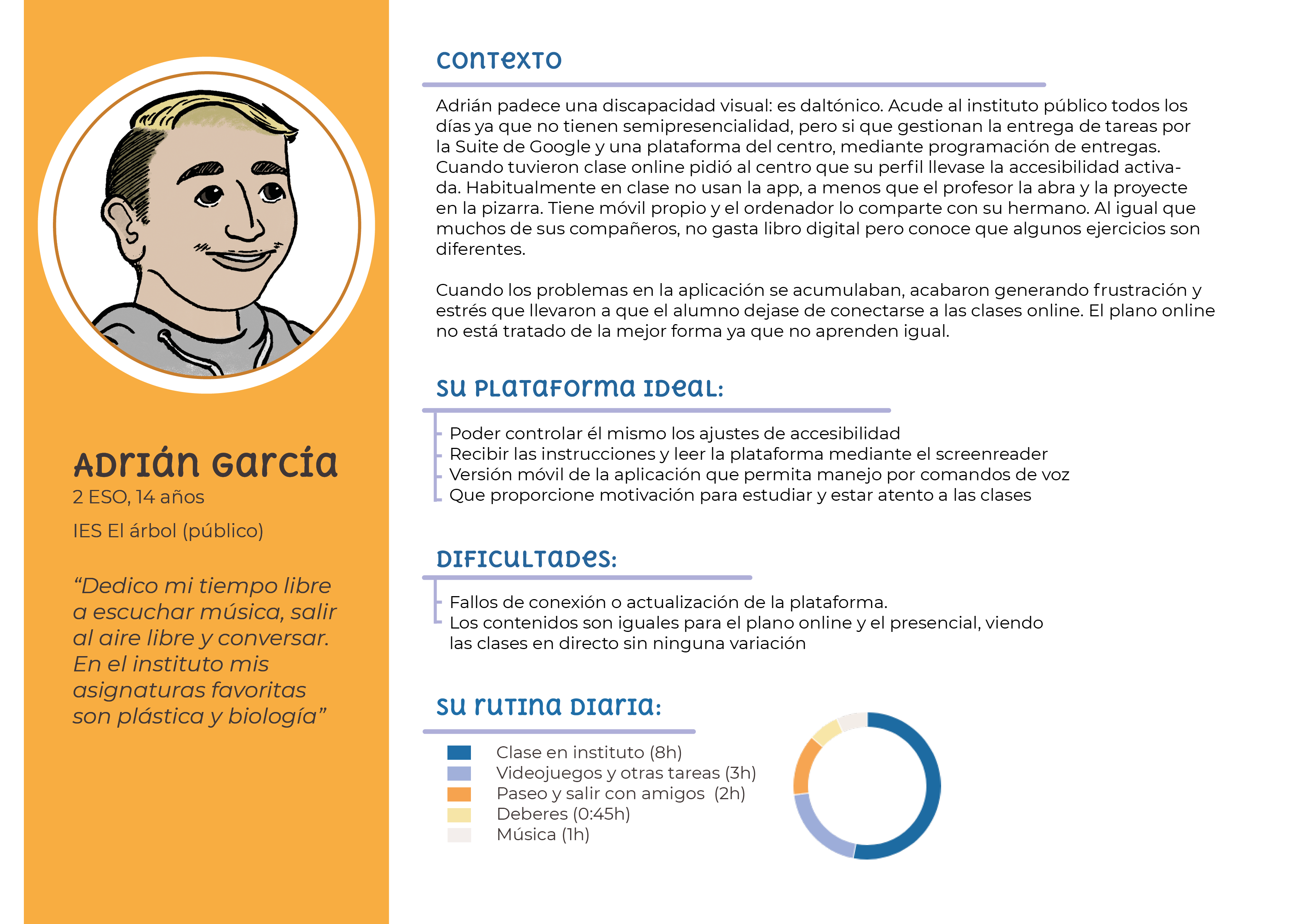
User personas: student profiles built from 245 surveys in 7 schools.
Research
Going into the classroom to design the solution
Before designing, I spent weeks understanding blended education by analyzing official curricula, textbooks, key competencies and platforms in use to detect real friction points. This immersion transformed my research into a conversation with those who live the problem, enabling deep empathy with teachers and students beyond theory.
Although access to schools was complex, I achieved a representative sample that changed the project's direction: I combined 245 surveys in 7 schools in Valencia, 5 semi-structured interviews and a benchmark of 8 platforms. These data validated my hypotheses and allowed mapping market shortcomings, such as teacher burnout and the lack of tools adapted to real classroom realities.
Only
30%
of students had their own computer in class
This finding radically pivoted the project: from a desktop application to a mobile-first platform, designed to work on mid-range smartphones with low data consumption.
Educational platform benchmark: Hipatia vs. leading tools on the market.
Architecture
Mobile-first as a strategic and equity decision
I conceptualized Hipatia as a PWA (Progressive Web App) to remove barriers: it works without installation, with minimal data consumption and smooth performance on any smartphone tier. The goal was for technology to become an aid, not a new obstacle.
I applied information architecture and instructional design principles to reduce cognitive overload. A simplified structure ensures the product is viable and effective, even for users with low digital skills or limited resources.

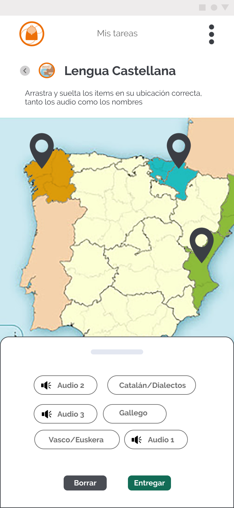
Visualization of three task types designed in the application.
The bridge between physical and virtual classroom
I designed an experience flow where students can pick up their learning without gaps. In-person and digital tasks coexist in a single timeline, eliminating friction between what happens in class and what happens at home.
Task management adapted to reality
I leveraged the smartphone features already in students' pockets: the camera to photograph physical tasks and upload them directly from the app. Students stay connected without needing a computer or scanner to digitize school work.
Experience
Reducing teacher fatigue without losing the student along the way
Student demotivation when studying alone and teacher burnout are the two key problems of post-COVID blended learning. Hipatia's design aims to improve the experience on both fronts through adaptive tracking that prioritizes the human over the administrative.
The goal was not to turn this platform into another file repository, but to build one that helps complete the learning cycle with the least operational effort possible.
Teacher user experience flow, reviewing courses and submitted tasks by list or by individual student.
Gamification and progress
Based on UDL guidelines (Universal Design for Learning) and learning psychology applied to 12–14 year olds, I included a visual progress and achievement system that encourages autonomy and maintains engagement without infantilizing the experience.
Eliminating teacher burnout
I reduced administrative load by automating feedback and centralizing alerts. This lets teachers instantly identify students at risk of disengagement, ideally saving 2 to 4 hours of manual management per day (a key pain point that emerged in interviews).
Adaptive tracking
A dual dashboard that gives students a clear view of their goals and teachers a real-time map of the class, eliminating the need to generate and export external reports.
Design System
A system built from constraints
Hipatia's visual identity is not merely aesthetic — it stems from accessibility. I used a palette where orange provides energy and teal-green provides calm, always validating that contrast met WCAG AA and that reading remained possible for users with visual diversity. The result is a robust system that allows the application to be viewed without issues on both a mid-range smartphone and a classroom computer, always maintaining clear hierarchy.
Color blindness validation
Hipatia's design system was built with accessibility, scalability and consistency across devices in mind. The color palette was validated using color blindness simulators (Adobe Color, Spark and Colorblind Simulator) for the three most common profiles: tritanopia, protanopia and deuteranopia.

Design System: WCAG AA contrast validation and color blindness testing across three profiles.
Results
A realistic product aligned with user need
Hipatia is a prototype and a learning exercise, not a production product. Implementation is outside the thesis scope, but the research method, accessibility decisions and design system are what I now apply in professional product work.
245
surveys with students and teachers across 7 schools in Valencia
8
educational platforms analyzed in the benchmark
3
color blindness profiles validated: tritanopia, protanopia and deuteranopia
Research-driven design
Detecting that the phone was the only device 100% present in students' homes changed the project's approach, elevating it from an educational website to a social equity tool.
User validation
In-person prototype testing with students and teachers was planned in the initial plan, but group dynamics were not feasible during lockdown. This phase would be the natural continuation of the project.
Scalable learning
The methodology of this thesis taught me not to design for ideal users, but for real users with hardware, time and vision limitations. Key learnings I subsequently applied in my professional career.
Complete experience: prioritizing smartphone over desktop.
Continuity
What I would do differently today and how I would continue the project
- 1
Re-evaluate decisions from a strategic and expert perspective
As a learning project it gave me a lot and a good foundation, but to move forward successfully I would re-evaluate many decisions from my current experience in product, design and AI and considering the evolution of the context and blended education.
- 2
Prototype testing with real users
Conduct in-person tests with students and teachers to identify interaction and usage issues, gather feelings about the experience and validate the adaptive progress system.
- 3
Expert-labeled corpus to train the AI
Collaborate with teachers to generate a set of labeled activities and alternative resources, and from that train a model capable of recommending specific exercises to each student based on their profile.
- 4
Institutional communication strategy
Bring the project to institutional education frameworks and pilot schools to validate real adoption. Without that step, the methodology remains on paper.
Aprendizajes
What I learned
01
The real user always beats the ideal user
Surveys confirmed hypotheses, but teacher interviews helped me question my preconceptions. Designing for a child with an old phone and limited connectivity is harder, but more rewarding than designing for the latest technology. Without that step, the product would have solved the wrong problem.
02
Accessibility is a business and an ethical decision
Validating the palette for color blindness from day one produced more coherent solutions than I would have made without that constraint, without limiting my creativity.
03
Product design is, above all, problem solving
Without a real client, my 'client' was the digital gap. This project was my ideal testing ground to apply the same rigor as in a professional project and learn to make data-driven decisions and develop my own judgment.
Let's talk
Do you have a project?
I'm open to product design projects, branding and collaborations that make human sense. Tell me what you're thinking.