Case study | UX/UI · Design System · SaaS · AI
Building the design foundation that drove product growth
I designed the experience, brand, and design system of an AI-powered SaaS platform that enabled scaling from proof of concept to MVP.
Role
Product Designer
UX/UI, branding, design system and UX writing
Team
4 people
1 PM · 1 Designer · 2 Devs
Duration
5 months
February — July 2024
Tools
Figma
Maze · Tailwind CSS · React
TL;DR
Understand the project in 3 key points
01
CONTEXTJotty was an AI meeting assistant prototype that worked technically but lacked product identity. I joined as the design profile on a team of 2 developers and a product with no established visual criteria.
02
ACTIONI proposed and built a design system from scratch (tokens, components and flows) both in Figma and directly in code (React + Tailwind).
03
RESULTThe system was reused across 3 technical proposals and 1 additional product. The team no longer depended on the designer to implement new screens.
Contexto
Scaling the technical prototype into a real product
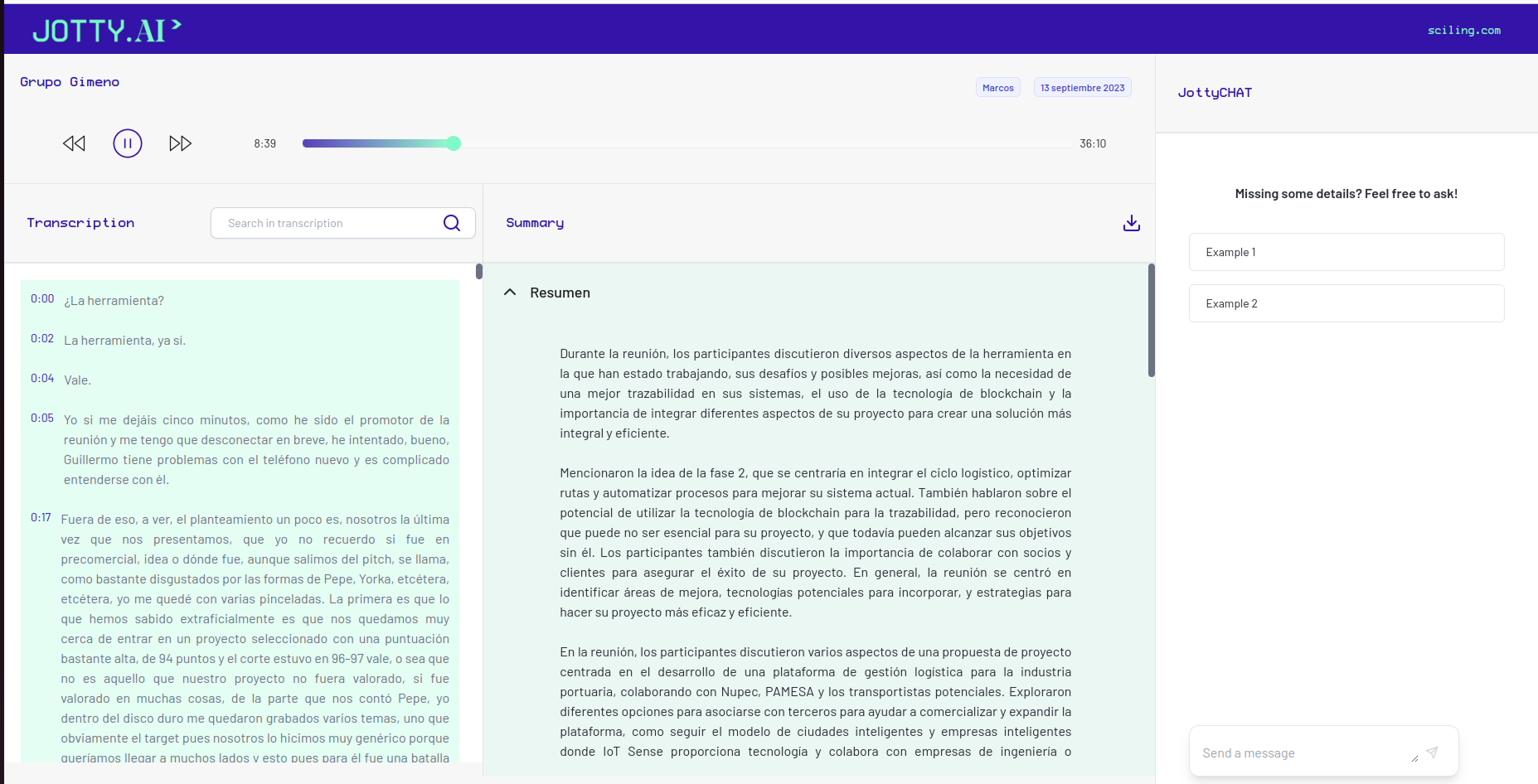
Jotty is the AI-powered meeting assistant developed by Sciling that records video calls, transcribes them and generates editable summaries. When I joined, the product had solid technology and agile development, but growth was driven entirely by engineering. My role was to transform that technical power into a coherent user experience, ensuring every visual advancement was functional, logical and easily implementable by the team.
The challenge
The lack of a shared design reference led to direct decisions in code that could end in inconsistencies and technical debt.
The goal
Educate on the value of design within a highly technical team and build a foundation that would allow them to advance with visual autonomy.
Initial state: a functional tool but without hierarchy or identity.
Users
Process
From tactical support to strategic decision-making
I started working reactively, resolving critical flows and responsive issues so as not to slow down the team. But soon I identified a pattern: every new request was a patch. If we wanted to scale, we couldn't keep designing exceptions, so to resolve this I proposed building a minimal, solid design system aligned with the team's way of building code.
In a team where design is new, theory isn't enough; proposing something like this required pragmatic justification. Instead of selling a "Design System" as an abstract concept, I framed it as an operational efficiency solution.
Standardizing rules would make us faster and reduce development uncertainty in each sprint. Arguing it that way and demonstrating the value it added was what drove its adoption. This shift changed the dynamic: design stopped being an 'extra step' and became the engine of team velocity.

Meeting notes component — design system applied.
The system
Design infrastructure: a shared language between Figma and code
I designed a system based on atomic design logic, where components were born from real product needs rather than a theoretical catalog. Pieces were designed on demand, when conceptualizing new features and screens, so that any team member understood why each component existed, how to use it and its variants, without my presence.
To reduce friction, I defined each level both in Figma and directly in code (React + Tailwind CSS), maintaining a shared, consistent nomenclature for component names, properties (type, size, state) and values (primary, secondary, sm, md...). That common taxonomy was what made the system work as a team language, not just an isolated design library.

Building the playback header and meeting info with different levels of components.
Design tokens
I established the visual DNA: semantic color, typographic scales and spacing defined in the Tailwind config as an exact mirror of Figma.
Base components
Button, Input, Badge… designed with their states and variants, implemented in code as paired files (JSX + CSS) ready to use.
Compound components
Dropdowns, sidebars and user profiles. Designed in constant dialogue with technology and product constraints, forming the pieces on which complete screens would be built.
Code as source of truth
As the system consolidated, the source of truth moved to code. Maintaining two sources would have created the desynchronization the system sought to solve.
Product
Balancing user value with technical cost
- Multimedia hierarchyLayout decisions like the hierarchy between transcript and multimedia, or the structure of the generated summary, conditioned how users understood Jotty's value.
- Cost vs. valueHow do we balance delivering user value with the development investment? Every feature was evaluated against its real technical cost before entering the backlog.
- ICE scoring and PRDsWith the PM onboard we started working in sprints with ICE scoring and PRDs, refining the process of evaluating options and features with shared criteria.
- System under pressureMy focus shifted to ensuring the design system could withstand the backlog's iteration pace without breaking, reusing components to avoid generating exceptions.
- Managing uncertaintyIn a product where AI generates content, managing uncertainty is key. Each state (processing, empty, error, saved, validation) was designed to reduce anxiety and reinforce a sense of control.
- Microcopy as trustMessages like 'We're generating your summary, less than 2 minutes' aren't filler text — they're the moments where the product risks and either wins or loses user trust.

Jotty's evolution from the PoC prototype to the final result.
Results
Efficiency and scale demonstrated
Jotty went from being a technical prototype to a platform with a defined experience. We achieved a robust MVP where the technical team gained visual autonomy, implementing new screens while maintaining coherence without constant intervention from me.
+10
Core components designed and implemented in Figma and code
4
Technical proposals conceptualized in Figma reusing the design system
1
Shared taxonomy that closed the gap between design and development
Process
Every new feature was built by reusing components instead of creating exceptions.
Adoption
The system was so practical it was reused to conceptualize 3 technical proposals and 1 additional Sciling product.
Quality
The MVP allowed the product to be used by beta users while maintaining a coherent experience aligned with the technology.
Final product scale — complete meeting notes with design system applied
Aprendizajes
What I learned
01
Context defines design as much as the user does
In a team with no previous design experience, part of the work is introducing the process without imposing it — demonstrating its value through results, not presentations. Knowing how to work in contexts where design doesn't yet have an established place is as important a skill as knowing how to design well.
02
You're not always asked to build a system, even when one is needed
Sometimes you have to propose it, justify it and accept that in the short term it produces less immediate visibility. But its development and adoption is what allows the product to truly grow.
03
A system needs stewardship, not just construction
Part of the value of design goes beyond delivering the system. Active maintenance, judgment and someone who protects its coherence over time are essential.
Let's talk
Do you have a project?
I'm open to product design projects, branding and collaborations that make human sense. Tell me what you're thinking.