Side Project
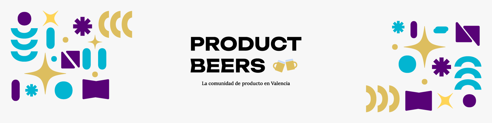
Product Beers
Visual identity for a product event that started as an MVP and became a monthly gathering. Logo design, shape system, color palette and social media creatives.
What I did
Branding & visual identity
Team
4 organizers
When
May — June 2023
Tools
Illustrator · Figma
Context
From event MVP to
What started as an informal event to share product design and development experiences at Sesame's offices became a monthly gathering for professionals in Valencia. With two editions already done and a third on the way, the social media presence was starting to ask for more consistency. The goal of the redesign was clear: unify the logo across its applications, create a scalable system in case the event expanded to other cities, and give it an identity that could hold up month after month without becoming repetitive.
Inspiration
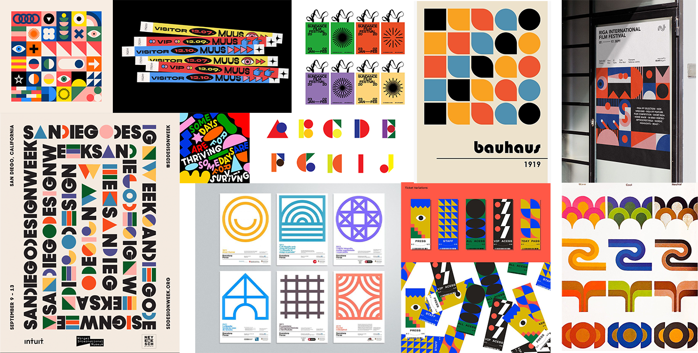
Moodboard and graphic
Three key decisions guided the creative process: a display typeface with strong visual weight, geometric elements representing diversity, and a vibrant palette. We ran a brainstorm of ideas, trends and graphic directions, looking for a result that was viable but with room to experiment. The moodboard references shared a pattern: reduced color palette, heavy typographic weights and compositions that worked like puzzle pieces — which defined the brand's art direction.
Logo
Shapes born from the
"Unbounded" was the chosen typeface. Despite being a straight sans serif, it had its own identity thanks to the construction of letters like B and E — that dynamic energy conveyed the sense of moving forward, of continuing, that we wanted to project.
The geometric pieces of the identity were extracted directly from the compositional elements of each letter and their counterforms. A system where everything is built from the same base, without invented shapes. To these were added some circle deformations, like small stars, to complete the play.
One challenge remained: filling the lateral space created by the difference in length between "Product" and "Beers". After several tries and with the team's help, the solution appeared naturally: a beer glass. Built with the same shapes from the system, it was coherent both visually and in meaning.
Color
Three colors that tell the
The exploration started without restrictions: free combinations, extended palettes. Too many options. We narrowed it down to 2 primary and 4 secondary colors, and when we realized the beer in the logo had to harmonize with the whole in both shape and tone, we reduced it to three. Those three colors conveyed the energy of the event without resorting to neon tones that are difficult to manage both on screen and in print.
Applications
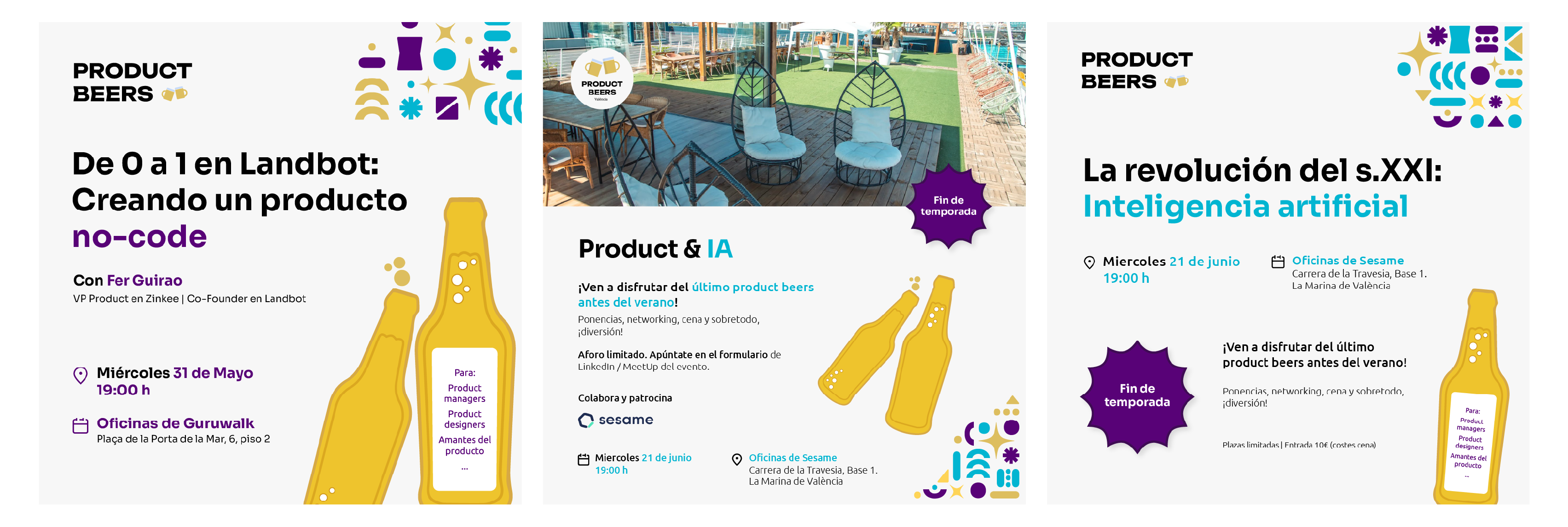
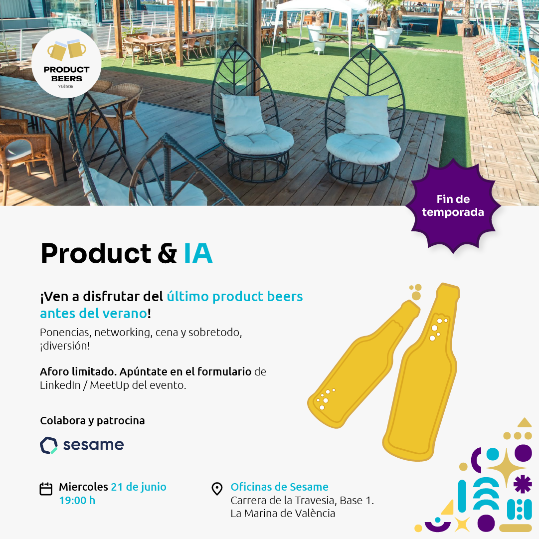
Creatives for
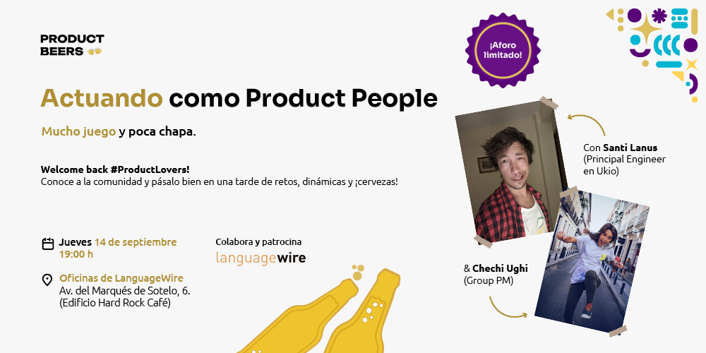
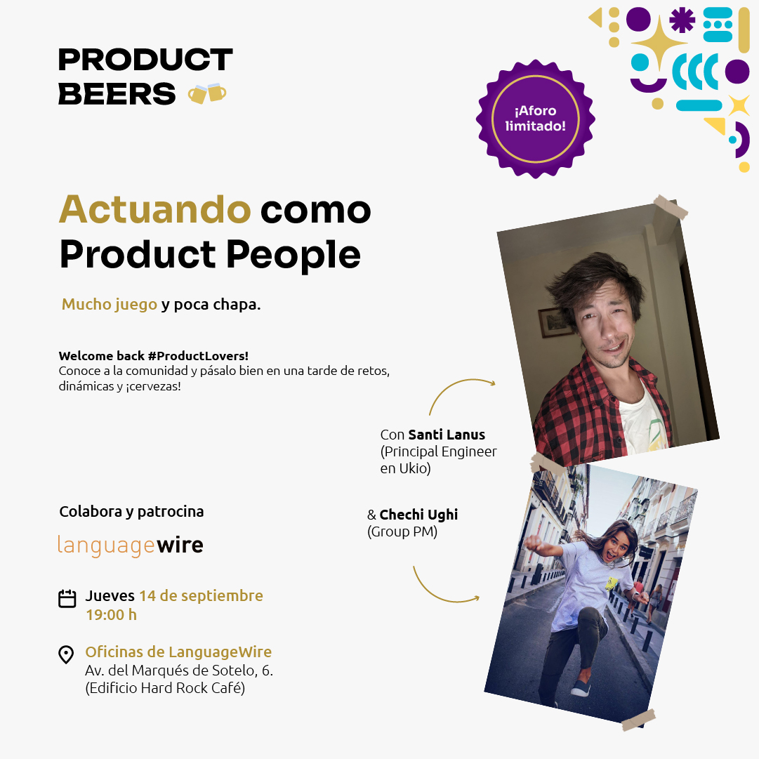
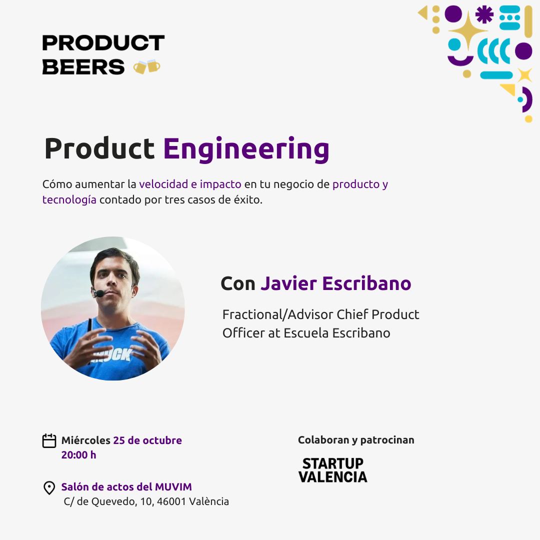
The identity was applied to monthly creatives to announce each edition. The colors and the shape play allowed personalizing each event — changing the color combination or shape arrangement — without breaking coherence. Not every month would look the same, but all were unified under the brand umbrella.
Aprendizajes
First identity brief for an
Designing this identity was a first branding brief for an event: different from the usual, with its own constraints.
01
What moves things most is initiative
Immersing myself in a group of people I didn't know and starting something from scratch was the real challenge. Not waiting for someone to ask, but stepping up and maintaining the level with only a month between each edition.
02
A flexible yet memorable identity system
Each edition could vary in color or composition, but at first glance it was recognizable as Product Beers. A system was achieved that held up over time and repetition without losing its identity.
03
Building identity is also building a team
Together with Carlos Miguel Corada, Carlos Moya and Guille Songel we built something more than a logo: an identity with which the event began to have its own face and the community began to recognize itself.
Let's talk
Do you have a project?
I'm open to product design projects, branding and collaborations that make human sense. Tell me what you're thinking.